Origin Home Media
UX Design / Frontend Development
Smart Home Systems Designed & Built For The Way You Live
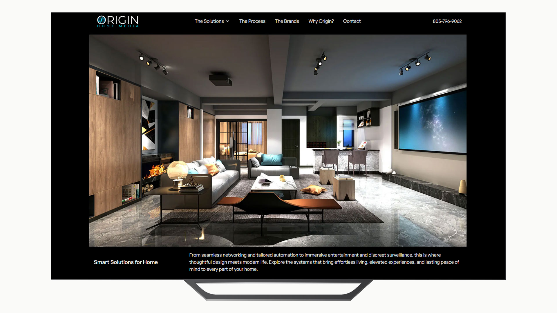
 The original site
About The Project
This case study showcases a recent collaboration with Origin Home Media, a leading smart home systems designer-integrator based in Southern California.
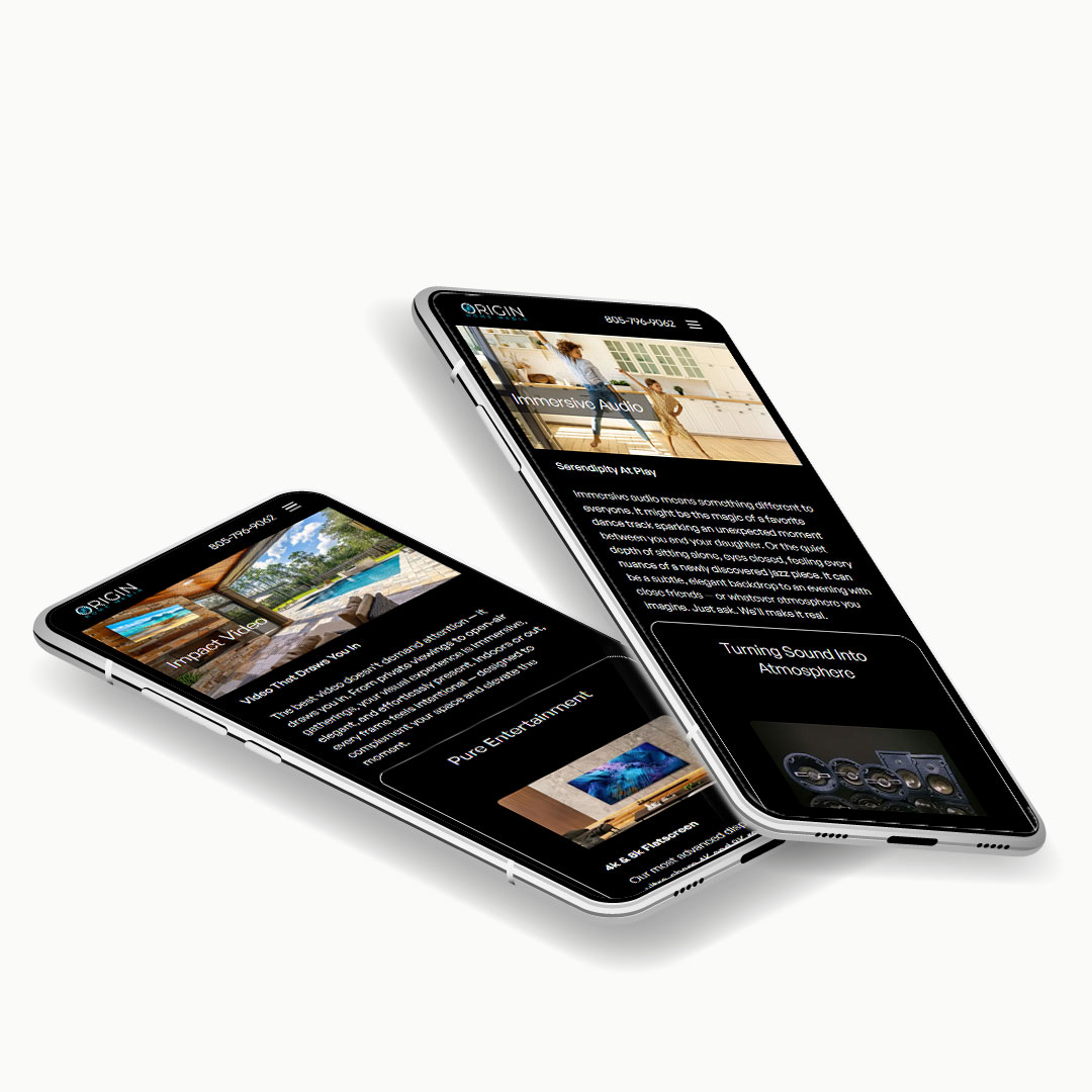
Origin Home Media needed a new digital presence that moved beyond technical specs and product lists — one that expressed the lifestyles their systems make possible. As the region’s leading smart home designer-integrator, Origin's value lies not just in automation or connectivity, but in crafting lifestyle-first environments that adapt naturally to how people live.
This project was designed not just to showcase an upgraded brand image, but to solve real user and business problems through strategic thinking, research-backed decisions, and attention to cross-functional needs. It reflects a process rooted in design thinking, collaborative execution, and scalable design — with every design decision supporting downstream implementation across product, engineering, and marketing.
[The Process]


Mobile First Approach and Agile Design
[Research]


Competitive Audits and Field Research
As with all foundational research, we conducted competitive audits to assess market position, brand voice, strengths, weaknesses, and strategic gaps of the competition.
We also visited live customer sites to observe real-world behaviors and systems in action.
[Empathy-Define]


AI Assit Facilitates The Define Process
We used several LLMs to facilitate analyzing research data and producing everything from personas to problem statements.
We used Open ai and Perplexity ai APIs to process our custom work flows suited to the project. Valuable insights from user surveys and empathy maps as well as field study data provided the basis of persona creation.
[Ideation]


The Color Palette
Color choices were intentionally minimal. With no plans for advanced interactivity beyond basic forms and CTAs, light/dark theme toggles were deemed unnecessary.
Black was selected as the primary color for its association with luxury, complemented by a single accent color — Sky — to integrate brand elements. Standard warning and success colors are applied where appropriate, and all selections meet WCAG 2.2 accessibility standards.
[Design]


Paper Wireframes
When ideas are moving faster than pixels, I reach for paper. Sketching wireframes by hand remains my go-to for brainstorming and quickly exploring early concepts — it’s the fastest way to keep pace with rapidly developing ideas.
Media breakpoints were defined early, with responsive behavior structured using Figma’s auto layout frames. Accessibility is guided by WCAG 2.1–2.2 standards and supplemented with ARIA roles when not natively supported by browsers. For edge cases, practical judgment ensures sensible outcomes.
Awareness is the foundation of inclusive design — yet unconscious bias often shapes decisions without our realizing it. Tools like Project Implicit (https://implicit.harvard.edu/implicit/) help surface those hidden biases in us, offering a critical step toward designing more thoughtfully and inclusively.
[Low-Fi Wireframes]

Visual Style
Aside from choices for Typography and Color, Iconography choices are consistent with brand values and user familiarity.
Font Awesome makes it easy to integrate with Figma’s component structure which translate well into light weight imagery and is easy for conversion at frontend development.
[High-Fi Wireframes]
Final copy and image treatments have been applied, with all interactions finalized and retested for consistency and performance.
To restore visual fidelity lost through JPEG compression, images were enhanced using Topaz Labs Adjust AI.
Designs were built with handoff in mind — using Figma components, auto layout, and tokenized styles to mirror React structure.


[Frontend]


